
Statements editor
For components Statements and Layer statements a specialized editor is available. It allows defining statements using the JSON format.
Editor location
The statements editor is available in the Basic properties components Statements and Layer statements.
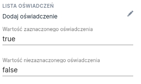
Illustration 1. Embedding location of the statements editor
The editor opens after clicking Add statement.
Editor presentation
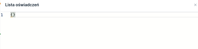
Opening the statements editor results in a drawer sliding out presenting an area to enter text in JSON format. For a newly created component it contains only empty curly braces. Line numbers are visible on the left side of the editor.
The statements editor can be displayed in read-only mode and in edit mode. Read-only mode only allows viewing the saved values.
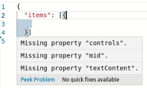
The editor highlights both semantic and syntax errors in real time. Hovering the mouse cursor over the red underline that indicates an error displays a tooltip showing its content.
Editor behavior
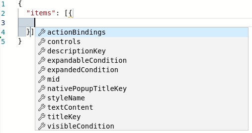
The statements editor supports syntax suggestion functionality. After pressing the key combination Ctrl + Space a suggestion containing possible fields to enter is displayed depending on the current cursor position in the editor. Selecting one of them and pressing the Enter key inserts the selected suggestion into the editor.
The editor can be closed in two ways. The first is the symbol X located in the upper right corner (visible in Illustration 2). The second way is to click outside the editor area.
Available fields
The statements editor accepts the fields listed below. Their meaning will be explained in the next paragraph. Required fields are additionally marked:
Meaning of fields
items
The list of defined statements to display.
textContent
An artifact with the statement content displayed below the title given in titleKey. If the artifact is specified and the key is not provided titleKey and a control is defined in controls, then the textContent will not contain the control.
textContentUnexpanded
An artifact with the statement content displayed when the statement is collapsed.
mid
Business identifier of the given statement.
visibleCondition
Conditions under which the statement should be displayed. If the condition is empty or invalid, the value "true" will be evaluated.
styleName
Style name.
expandableCondition
The condition for which a collapse/expand text for the statement content should be displayed next to the statement title. If the condition is empty or invalid, the value "false" will be evaluated. Note: if titleKey is undefined, the text will not appear.
expandedCondition
If expandableCondition is set to "true", the property expandedCondition decides whether and when the statement content should be expanded by default. If the condition is empty or invalid, the value "true" (content expanded) will be evaluated.
titleKey
The title key of a single statement defined in the Translations. Variables are resolved in the keys.
nativePopupTitleKey
The title key of the native popup that will be displayed when clicking "More" → this text can be overridden by i18n.statements.item.native.more in the Translationstab. The popup is displayed only in the native application. If nativePopupTitleKey is not defined, the value of the key titleKey.
event
Event to add if an action on the application associated with the given statement item has been defined.
controls
The list of defined controls for the given statement. The explanation of the object fields controls is provided below.
Defining the list of controls (controls)
mid
Business identifier of the control (required field).
titleKey
Title key displayed next to/above the control.
visibleCondition
Conditions under which the control should be displayed. If the condition is empty or invalid, the value "true" will be evaluated.
requiredCondition
Condition for which the control should be required. If the condition is empty or invalid, the value "true" will be evaluated.
type
Control type: RADIO - a statement with two radios YES/NO (other types like CHECKBOX may also occur according to the JSON definition).
notSelectedErrorTextKey
Translation key overriding the text "You did not make a selection".
requiredNotAcceptedErrorTextKey
Translation key overriding the text "Consent to the selected statement is required".
styleName
Style name.
mastercheckbox
Id of the master checkbox.
Last updated
Was this helpful?