
Tile group - TileGroup
A single-choice group whose options are represented visually by a tile
Component properties
Label (section Basic properties)
Each component should have a label (
Label for the component.
Number of columns (section Layout)
columns
Number of columns in the component - value considered only when the component's domain is powered by External data source (External Data Source).
More information about component properties: Common component properties
Component value
The component's value is set to the value of the field selected by the user Tile (Tile - Tile). No selection means that the property value of the component is an empty string.
Internal components
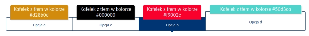
Inside the component Tile group one type of component can be embedded — Tile (component description in Tile - Tile). The way components are arranged inside the tile group can be specified using the field Number of columns available in the Layout.
Component input parameters
id
The value taken by the selected tile (required field). An empty value returned from the service will cause a system error.
content
Tile content written in HTML (scripts inside this HTML are not supported by the platform).
additionalContent
Additional tile content written in HTML (scripts inside this HTML are not supported by the platform). Functionally it may behave differently depending on the chosen implementation, for example content that should be additionally displayed when a given tile is selected.
title
Tile title.
columns
Number of columns on which tiles should be laid out (optional field). The value returned from the service overrides the value set in the Number of columns parameter.
value
The value the group will take after the domain is populated (optional field). If a value outside the domain is returned, the default value will be set (if it exists in the new domain) or an empty value.
popupTriggerLabel
Label text whose click will show a popup (Optional functionality. Not available in all deployments.)
popupTextContent
Name and version of the text content (in the format name-version) that will be shown in the popup (Optional functionality. Not available in all deployments.)
Clearing selection
To clear the current selection, set the component to an empty value (value), where an empty value means an empty string: "". It should also be noted that resetting the selection does not restore the default value, but unchecks the currently selected Tile.

Last updated
Was this helpful?