
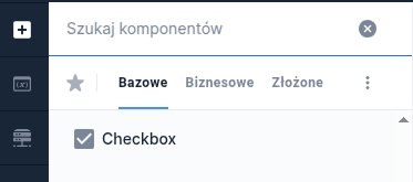
Checkbox
Checkbox
Component properties
Button selection (section Other)
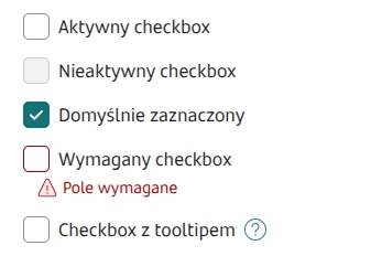
checked
Specifies whether the field should be checked by default (initially set to "false"). The equivalent of the default value for other fields.
Value of the checked button (section Other)
valueYes
The value the checkbox takes when it is checked - by default, if no other value is set, the returned value is "true".
Value of the unchecked button (section Other)
valueNo
The value the checkbox takes when it is unchecked - by default, if no other value is set, the returned value is "false".
Checkbox positioning (section Other)
tickPosition
Availability of the functionality depends on the license and may not be available in all deployments. By default empty (set to DEFAULT), places the checkbox in the middle of the component in vertical orientation. Set to TOP places the checkbox at the top of the component in vertical orientation.
Content (section Basic properties)
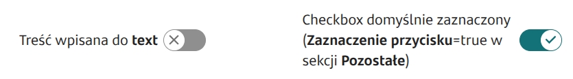
text
Text displayed next to the component. It is possible to refer to variables or fields e.g.: ${sessionVariable1} or ${GesTextField1}
Description (section Other)
description
Availability of the functionality depends on the license and may not be available in all deployments. Specifies the business description of the field - the way it is displayed depends on the specific implementation of the component.
More information about component properties: Common component properties
Feeding the checkbox text with different content
If the text next to the checkbox needs to depend on a condition and display different (or formatted) content, it can be fed with content from the TextContent component. To do this, attach on the checkbox in the field External data source service TextContentService, in which we provide as the input parameter component an artifact containing the text to display. In the output parameters for the attribute text and value we choose the output parameter artifact.
A button directing to detailed information can be placed inside the TextContent by inserting the tag <div class="ex-checkbox-more-info-label"></div>.
Content defined in moreInfoLabel can be defined dynamically (for example fed from a Text Field or another component placed on the form).
Information about the component state
Information about the current value of a given component property, which can then be used in the form e.g. to feed another field with the value of this property, can be obtained using the construction COMPONENT_ID$PROPERTY_NAME
For the checkbox you can retrieve the following properties:
moreInfoButtonClicked
true - if the link to detailed information has been clicked at least once
Available events
CHECK
Event emitted when the checkbox is checked
UNCHECK
Event emitted when the checkbox is unchecked
Available actions
Action documentation: Actions
CHECK
Checking the checkbox. NOTE: does not emit the CHECK event
UNCHECK
Unchecking the checkbox. NOTE: does not emit the UNCHECK event
TOGGLE
Change the checkbox value to the opposite. NOTE: does not emit CHECK and UNCHECK events

Last updated
Was this helpful?