
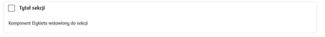
Section with checkbox - CheckboxSection
This component, like Section, allows grouping other components while simultaneously presenting a checkbox in the header.

Component properties
Value of the checked button (section Basic properties)
valueYes
The value the checkbox takes when checked - by default, if no other value is set, the value "true" is returned.
Value of the unchecked button (section Basic properties)
valueNo
The value the checkbox takes when unchecked - by default, if no other value is set, the value "false" is returned.
Section title (section Basic properties)
title
Content that is displayed next to the checkbox. You can use wiki markup here and refer to variables ${variable}.
Dynamic section titles (section Other)
sectionDynamicTitles
Allows providing dynamic contents for the section checkbox that depend on conditions. The first title in order whose condition is met will be displayed. If none of the conditions are met, the title provided in the property is displayed Section title.
Button selection (section Other)
checked
A value that determines whether the checkbox is checked by default.
More information about component properties: Common component properties
Last updated
Was this helpful?