
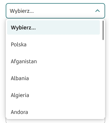
Value selection from a list - Combobox
Value picker from a list

The value picker from a list is a component that requires being fed by a data source. To do this, in the component panel you need to go to the Properties section of the component Interactions and select External data source. Then in the visible window click Select service and search the list for the appropriate dictionary, service or script. Each of these items is marked with a different icon in the list. After selecting the appropriate data source, its name and type information appear in the External data source section:
DICTIONARY - if a dictionary was selected,
EDS - if a service was selected,
SCRIPT - if a script service was selected.
Details: Connecting a dictionary data source.
Component properties
Number of characters to start searching (section Basic properties)
minTextLenghtToSearch
Specifies after how many entered characters the component's values should be searched. Availability of this functionality depends on the license and may not be available in all deployments.
Enable search option (section Basic properties)
searchable
Enable the search option (by default the property is not selected) - depending on the license and/or channel:
when the property is set to "true" - clicking the component displays a field for entering the search value
when this property is absent - clicking the field, typing characters (which are not displayed) filters the values.
Field description (section Data quality)
description
Text displayed as a description under the field; by default this is empty. Availability of this functionality depends on the license and may not be available in all deployments.
Position of the additional description (section Styling)
descriptionPosition
Description position (choose from values NONE, BOTTOM and RIGHT). To display the dictionary with a description, a dedicated service must be attached (field External data source). Availability of this functionality depends on the license and may not be available in all deployments.
Label for a single item in the list (section Other)
singleValueLabel
Specifies the component's behavior when there is only one element in the list. If the option is selected, the dropdown is replaced by a label (by default the property is not selected).
Content presentation adapted to field size (section Other)
truncateContent
This property allows limiting the presentation of the selected value to as many characters as fit in the standard size of the component added to the form. All characters exceeding that size will be replaced by an ellipsis (...). By default the property is selected. If the property is deselected, the component's height will be adjusted to the size of the text in the selected value. Availability of this functionality depends on the license and may not be available in all deployments.
Native on mobile (section Other)
nativeOnMobile
Specifies whether the native "" component is displayed in the mobile version. Deselecting the property causes a popup to be displayed for every device (by default the property is selected). Availability of this functionality depends on the license and may not be available in all deployments.
Additional label (section Other)
descriptionLabel
This is an additional description concerning the component. It is subordinate to the property Label. Availability of this functionality depends on the license and may not be available in all deployments.
Display "Choose..." (section Other)
emptyOption
Display the "Choose..." option as the first item of the component (by default the property is selected). Deselecting the property causes the first element of the dictionary to be displayed.
Alternative text for "Choose..." (section Other)
emptyOptionCustomText
Text displayed instead of "Choose..." when the "Display 'Choose...'" option is selected.
Hide "Choose..." from the list of selectable options
hideEmptyOptionOnList
Hide the default "Choose..." value in the selection list (by default the property is not selected). For this property to make sense, it is necessary to enable the Display "Choose...". Availability of this functionality depends on the license and may not be available in all deployments.
Dictionary list height
listHeight
Height of the dictionary list (default value -1). Availability of this functionality depends on the license and may not be available in all deployments.
Dictionary list width
listWidth
Width of the dictionary list (default value -1). Availability of this functionality depends on the license and may not be available in all deployments.
Graphical representation of the component
presentation
Graphical representation of the component (choose from values STANDARD, WHEEL, VARIANT 2.0). The value STANDARD defines the standard appearance of the component, WHEEL is the presentation of the component as a scrollable wheel (available only in selected deployments). The value VARIANT 2.0 defines the new appearance of the component (available only in selected deployments).
More information about component properties: Common component properties
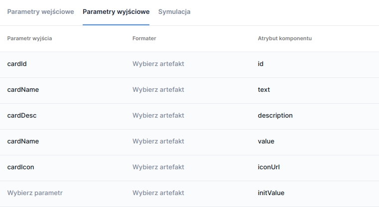
Component output parameters when fed from a service
id
Identifier of individual items
text
Label of individual items
description
Additional label of individual items
value
Component value
iconUrl
URL pointing to the graphic displayed as an icon in the field. Availability of this functionality depends on the license and may not be available in all deployments.
initValue
Initial value
metadata
Additional data of an individual item, used when collecting metrics. Availability of this functionality depends on the license and may not be available in all deployments.
Values in the dictionary will always be displayed in the order in which they appear in the supplying source.
Feeding the component via a service
Example implementation of a proxy-service:
Note! When attaching a service in the field External data source remember to:
correctly map the output parameters from the proxy (service outputs) to the appropriate component attributes,
fill in the option Position of the additional description (available in the component's Styling properties section) if the component is fed by a service that provides a description.
Last updated
Was this helpful?