
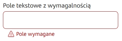
Text field - TextField
Single-line text input field.

Component properties
Disabled field presented as a label (section Basic properties)
labelIfDisabled
If set to true it means that a disabled component is displayed as bold text, without dimming, borders and background (in the form it looks like a Label). → demo form: demoLabelIfDisabled
The availability of features depends on the license and may not be available in all deployments.
Data type (section Data quality)
expectedType
Specifies the type of input data (available formats: STRING, LONG, DOUBLE, URL, EMAIL) in order to force the mobile channel to show a keyboard matching that type (e.g. to show only the numeric keyboard use type LONG).
Real-time formatting (section Data quality)
formatterRealTime
Specifies whether formatting should occur when the keyboard button is pressed or only after leaving the field. Default value is "false".
Validation after each character (section Data quality)
validationOnEverySign
Allows triggering validation (only required field and mask) on the component after every entered character. Component default value is 'false'. Availability of the feature depends on the license and may not be available in all deployments.
Character counter (section Data quality)
characterCounter
If set to true, a counter showing how many characters have been entered should appear under the field. If the field also has Maximum number of characters, that information will also appear. Displaying validation errors hides the counter. Availability of the feature depends on the license and may not be available in all deployments.
Autocomplete for empty field (section Data quality)
autocompleteForEmptyField
Allows showing suggestions immediately on entering the text field. It allows choosing one of the options or typing a choice manually. For a text field that should display suggestions, check the checkbox Autocomplete for empty field from the section Data quality. Connect an external data source, which is described below in the section Autocomplete - supplying suggestions.
Minimum number of characters that trigger suggestions (section Data quality)
minLengthToAutocomplete
Minimum number of characters for which the mechanism that triggers suggestions (autocompleter) will be activated. Value 0 means no such mechanism. For the functionality to work correctly the flag autoServerUpdate must be set to "false". Availability of the feature depends on the license and may not be available in all deployments.
Additional option in the list (key) (section Data quality)
autocompleteNoMatchButtonLabelKey
Translation key whose value is displayed in an additional button shown on the autocomplete suggestion list, which allows the client to declare that they did not find a suitable option in the domain. The button click emits the AUTOCOMPLETE_NO_MATCH_BUTTON_CLICKED action. Control of button visibility is described below in the section Autocomplete - supplying suggestions. Availability of this functionality depends on the license and may not be available in all deployments.
Filter suggestion list (section Data quality)
autocompleteOptionsFilterEnabled
Flag defining whether, when the suggestion list is supplied from a service, they should be platform-filtered based on the text entered in the field. Setting to false allows all case-specific suggestion logic to reside in the service. Default value: true. Availability of the feature depends on the license and may not be available in all deployments.
Show clear field button (section Styling)
showClearButton
Flag indicating whether the component should display a button to clear the field. Default value: false.
The availability of features depends on the license and may not be available in all deployments.
Maximum number of characters (section Data quality)
maxLength
Specifying the maximum number of characters.
Mask mismatch error message (section Data quality)
maskValidationError
Error label in case the value does not match the mask.
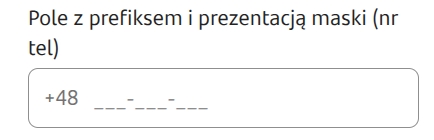
Mask presentation (section Data quality)
visibleMask
Allows the template designer to define the format in which data should be entered into the text field. The mask allows defining specific types of fields using the following characters:
S - letter (A-Z, a-z)
9 - numeric character
* - alphanumeric character
You can also include a desired separator in the mask, e.g. "-", "/". Example masks:
99/99/9999 - e.g. a date in format 05/02/2013
99-99-99 - e.g. a date in format 05-02-13
99-999 - e.g. postal code 61-123
SS999 - a string with two letters at the beginning and three digits at the end, e.g. CD123.
More information here: Simple validations
Prefix visibility condition (section Data quality)
prefixVisibleCondition
Specifies whether and when to present the prefix. Availability of the feature depends on the license and may not be available in all deployments.
Prefix (section Data quality)
prefix
Text to display in the prefix.
Suffix (section Data quality)
suffix
Text to display in the suffix.
Placeholder (section Data quality)
placeholderText
Text displayed as the field placeholder, default is empty. Availability of the feature depends on the license and may not be available in all deployments.
Formatter (section Data quality)
formatter
Name of the formatter used for the field.
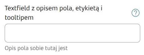
Field description (section Data quality)
description
Text displayed as a description under the field; by default this is empty. Availability of this functionality depends on the license and may not be available in all deployments.
Sensitive data mask (section Security)
sensitiveDataMask
Specifies the type of mask used for entered values, e.g. sensitive data (available types: NO_MASK, PESEL, ID_NUMBER, CELL_PHONE_NUMBER, PHONE_NUMBER). The default type is NO_MASK, for which sensitive data masking is not applied. Only a value coming from Data source from another field. Examples of operation: Sensitive data mask The availability of features depends on the license and may not be available in all deployments.
Disallowing illegal suggestion values (section Security)
forbidIllegalValues
Default value "false".
Paste ability (section Security)
pasteEnabledCondition
Conditional pasting into the field (if we set the field value to "false", it will not be possible to paste values from the clipboard into the field).
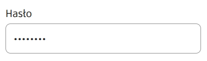
Password (section Security)
password
Set to "true" means that dots will appear in the field instead of the entered characters (i.e. the entered password will not be visible). Default value "false".
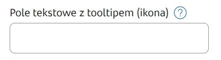
Icon (section Styling)
iconUrl
Availability of the feature depends on the license and may not be available in all deployments. Allows displaying an icon in the text field. Provide the icon address as a url or file path. Accepted file formats: png, jpg, svg.
If the option Disabled field presented as a labelwas checked, the defined Prefix or if Autocomplete is enabled then the icon will not be displayed.
More information about component properties: Common component properties

Autocomplete - supplying suggestions
To supply a component with autocomplete enabled with a suggestion list, you must attach an External Data Source (EDS) to it, which can be a dictionary or a service.
Supplying from a service
Input parameters
In the case of supplying suggestions from a service, that service may receive information about the value entered in the field. This value is passed in the parameter __searchText. Therefore, to be able to filter the search domain by the value entered in the text field, define an input parameter named "__searchText" in the ServiceProxy (the name begins with two underscores). This parameter does not need to be connected in any way on the control from Eximee Designer.
Output parameters
The service output should be mapped to the appropriate component parameters.
autocompleteValue
Subsequent values to display on the suggestion list.
showAutocompleteNoMatchButton
Optional flag indicating whether to display an additional button on the suggestion list (described under the property autocompleteNoMatchButtonLabelKey). Default is false. Availability of the feature depends on the license and may not be available in all deployments.
descriptionText
Additional value presented together with autocompleteValue.
Last updated
Was this helpful?