
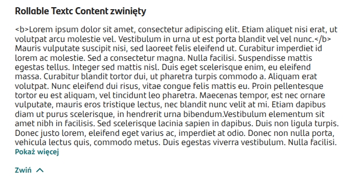
Formatted content (collapsible) - RollableTextContent
Component used to present an artifact Content with a collapse/expand option (used e.g. to display a legal notice).
Component properties
Field height (section Basic properties)
contentHeight
Component height (default set to 200). If the entire text does not fit in the component, a vertical scrollbar is inserted. Availability of this feature depends on the license and may not be available in all deployments.
Field title (section Basic properties)
contentTitle
Title displayed at the top of the component (default empty). Clicking the title collapses/expands the component content.
Presentation of field content (section Basic properties)
contentDefaultVisible
Showing the component content (by default the property is checked - value set to "true"). If the property is unchecked (value "false"), the component content is collapsed and will be displayed after clicking the expand arrow or the component title.
More information about component properties: Common component properties
If in the inserted artifact Content an expression was used /more/, the component will display a "Show more" button at that spot (clicking it will reveal the hidden portion of the content).
Attaching a content source in the component
To display content in the component, you must point to a previously created artifact Content (creating an artifact is described in: Creating and attaching a Content artifact).
Select an external data source
In the field EXTERNAL DATA SOURCE click Select service and attach the service TextContentService (description of attaching the service: Example of attaching a service to the component).

Last updated
Was this helpful?