
Slider
The availability of functionality depends on the license and may not be available in all deployments.
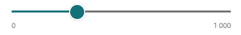
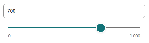
A component that allows selecting numeric values using a slider.
Component properties
Eximee Designer property
Attribute name in the Source
Description
Step interval at which a value can be set on the slider (section Basic properties)
step
Step of the value, i.e. the increment by which the slider value can be set (default value 100).
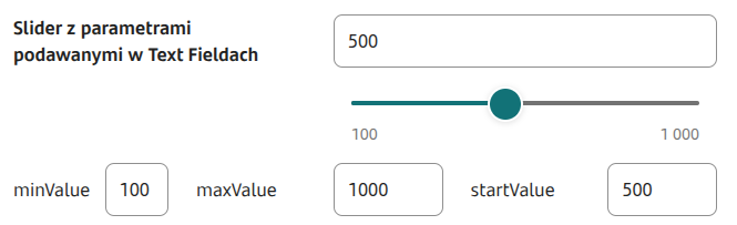
Slider start value (section Basic properties)
startValue
Starting value of the slider (default empty). Can be fed from a service.
Slider minimum displayed value (section Basic properties)
minValue
Minimum value of the slider (default value 0). Can be fed from a service.
Slider maximum displayed value (section Basic properties)
maxValue
Maximum value of the slider (default value 1000). Can be fed from a service.
Minimum possible value (section Basic properties)
minBlockValue
Minimum beyond which a value cannot be selected (default value 0). Can be fed from a service.
Maximum possible value (section Basic properties)
maxBlockValue
Maximum beyond which a value cannot be selected (default value 1000). Can be fed from a service.
Suggested value (section Basic properties)
suggestedValue
Suggested value (e.g. in the case of a renewable limit the amount suggested by the bank). Can be fed from a service. Feature availability depends on the license and may not be available in all deployments.
Suffix for the minimum and maximum slider label (section Other)
legendSuffix
Value "appended" to the minimum and maximum slider labels. Can be fed from a service. Feature availability depends on the license and may not be available in all deployments.
Predicted slider value on axis hover (section Other)
showPredictionTooltip
Showing the predicted slider value when hovering over the slider track (default value "true"). Feature availability depends on the license and may not be available in all deployments.
Presentation in the tooltip of the value indicated by the slider (section Other)
showTooltip
Displaying the value indicated by the slider (default value "true"). Feature availability depends on the license and may not be available in all deployments.
Formatter for the value displayed in the text field
textInputFormatter
Formatter for the value displayed in the slider's text field. Feature availability depends on the license and may not be available in all deployments.
Text input suffix
textInputSuffix
Value "appended" at the end of the slider's text field. Can be fed from a service. Feature availability depends on the license and may not be available in all deployments.
Description displayed after clicking the text field
descriptionPopupText
Description displayed after clicking the slider's text field. Feature available in mobile and native channels.
Minimum value exceeded message
minValueSuggest
Text displayed under the slider's text field when exceeding the minimum value. Feature availability depends on the license and may not be available in all deployments.
Maximum value exceeded message
maxValueSuggest
Text displayed under the slider's text field when exceeding the maximum value. Feature availability depends on the license and may not be available in all deployments.
Synchronization of the slider state and the value entered in the text field
separatedSliderValue
Controls synchronization of the slider state and the value entered in the input. When separatedSliderValue=true minBlockValue and maxBlockValue are not respected. Feature availability depends on the license and may not be available in all deployments.
IMPORTANT — on the Slider by default the values maxValue and maxBlockValue should match, unless they are intentionally different (then the Slider value will be limited to min (maxBlockValue, maxValue), so the upper limit will be the smaller of these values.). Similarly for minValue and minBlockValue.
In the Slider component (in the properties) it is not possible to set the starting/minimum/maximum value to a type other than integer.
More information about component properties: Common component properties
Copying the slider value to the Text Field and vice versa
If the Slider value is to be copied to the Text Field component, that component must listen to the Slider, and the value will be copied either by pointing the slider in the Data source from another field text component, or a special service will be set for the Text Field (e.g. EchoService).
Also the Slider value can be set based on the number entered into the Text Field component. For this, the Slider should listen to the TextField and point to that text field in the property Data source from another field of the Slider.
Slider with example properties
Specific appearance of the Slider
The availability of functionality depends on the license and may not be available in all deployments.
In some themes the text field is already integrated with the slider.
Component state information
Information about the current value of a given component property, which can then be used on the form e.g. to feed another field with the value of that property, can be obtained using the construct COMPONENT_ID$PROPERTY_NAME
For the slider you can retrieve the following property:
sliderValue
Value marked on the slider. If separatedSliderValue is set to true, it may differ from the component value.
Example: feeding Data source from another field via GesSlider1$sliderValue
Example validator for the Slider
The validator displays a hint for the Slider in specific situations.
When attaching the validator below, as a parameter you should enter insuranceComponentId the id of the component referring to the insurance (e.g. a checkbox controlling enabling/disabling the insurance) and as sliderId provide the id of the Slider on which you want to control the amounts. If the mentioned components are not embedded directly on the application, you should provide the full embedding path, i.e. the id of the composite component that contains those components and each parent composite component.
Demo application: demoSlider
Demo application in selected deployments: demoSliderValidationHint
Last updated
Was this helpful?