
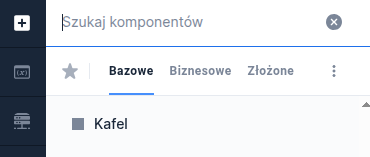
Tile
Availability of functionality depends on the license and may not be available in all deployments.
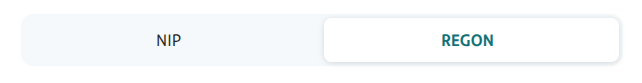
Single value of the component Tile group - TileGroup, single-choice field (the field can only be placed inside a tile group).
Component properties
Value of the selected field (section Basic properties)
option
Component value - the field cannot be empty
Content (section Basic properties)
content
Tile content (may be overridden by the service)
Title (section Basic properties)
title
Title displayed above the tile. Availability of functionality depends on the license and may not be available in all deployments.
Additional content (key) and Additional content (section Basic properties)
additionalContentKey
Translation key containing additional tile content, in a format analogous to Content. Functionally it may behave differently depending on the chosen deployment, for example content that should be additionally displayed when a given tile is selected (may be overridden by the service). Availability of functionality depends on the license and may not be available in all deployments.
Title color
titleColor
Background color of the title in hexadecimal format. Availability of functionality depends on the license and may not be available in all deployments.
Popup trigger label (key) and Popup trigger label
popupTriggerLabelKey
The label text which, when clicked, will show the popup. Availability of functionality depends on the license and may not be available in all deployments.
Additional content in the popup
popupTextContent
Name and version of the text content (in the name-version format) that will be shown in the popup. Availability of functionality depends on the license and may not be available in all deployments.
NOTE! Contextual help for Tile can be defined, but without using the help icon (the help tooltip can only be displayed when hovering over the tile).
More information about component properties: Common component properties
Component input parameters
content
Tile content written in HTML or WikiMarkup (scripts inside this HTML are not supported by the platform).
additionalContent
Tile content written in HTML or WikiMarkup, overriding the value taken from the translation additionalContentKey described in the component properties.
markupType
Type of tile content - values supported are those for Contents (Text Content). Optional parameter - the default value is HTML.
popupTriggerLabel
The label text which, when clicked, will show the popup. Availability of functionality depends on the license and may not be available in all deployments.
popupTextContent
Name and version of the text content (in the name-version format) that will be shown in the popup. Availability of functionality depends on the license and may not be available in all deployments.
Demo form: demoTileGroup
Last updated
Was this helpful?