The availability of functionality depends on the license and may not be available in all deployments.
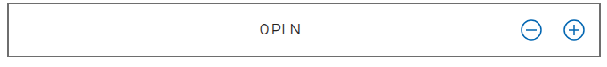
A component with a text field and +/- values that allow changing the value displayed in the text field.
Initial slider value (section Basic properties)
startValue
Initial value of the text field (default empty).
Step by which the value changes (section Basic properties)
step
The step by which the value can be changed by clicking plus/minus (default 100).
Minimum possible value (section Basic properties)
minValue
The minimum value the component can take (default empty).
Maximum possible value (section Basic properties)
maxValue
The maximum value the component can take (default empty).
Suffix (section Basic properties)
suffix
Text to display in the component text field suffix.
More information about the component properties: Common component properties
Demo request: demoPlusMinus
♿WCAG: WCAG best practices for low-code dev
Last updated 17 days ago
Was this helpful?