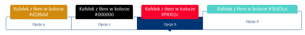
Tile group - TileGroup

circle-info

The availability of functionality depends on the license and may not be available in all deployments.

A single-choice group whose graphical representation of options is a tile

Component properties

Eximee Designer property
Attribute name in Source
Description

Label (section Basic properties)

label

Label for the component.

Number of columns (section Layout)

columns

Number of columns in the component - value considered only when the component's domain is fed by External data source (External Data Source).

More information about component properties: Common component properties

Component value

The component value is set to the value of the field selected by the user Tile (Tile - Tile). No selection means that the property value of the component is an empty string.

Internal components

Inside the component Tile group one type of component can be embedded — Tile (component description in Tile - Tile). The way components are arranged inside the tile group can be specified using the field Number of columns available in the section Layout.

Component input parameters

Parameter
Description

id

The value taken by the selected tile (required field). An empty value returned from the service will cause a system error.

content

Tile content written in HTML (scripts inside this HTML are not supported by the platform).

additionalContent

Additional tile content written in HTML (scripts inside this HTML are not supported by the platform). Functionally it may behave differently depending on the chosen deployment, for example content that is to be additionally displayed when a given tile is selected.

title

Tile title.

columns

The number of columns on which the tiles should be arranged (optional field). The value returned from the service overrides the value set in the Number of columns parameter.

value

The value the group will take after the domain is populated (optional field). If a value outside the domain is returned, the default value will be set (if it is in the new domain) or empty.

popupTriggerLabel

Text of the label whose click will show the popup (Optional functionality. Not available in all deployments.)

popupTextContent

Name and version of the text content (in the format name-version) that will be shown in the popup (Optional functionality. Not available in all deployments.)

Clearing the selection

To clear the current selection, set the component to an empty value (value), where an empty value means an empty string: "". It should also be noted that resetting the selection does not mean restoring the default value, but unchecking the currently selected Tile.

Illustration 1. Example appearance of the component on the application

Illustration 2. Example appearance of the component with tiles containing a title

circle-info

Demo applications: demoTileGroup

Last updated

Was this helpful?