
Step slider
The availability of functionality depends on the license and may not be available in all deployments.
Step slider component.
Component properties
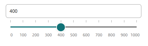
Initial slider value (section Basic properties)
startValue
Initial slider value (default empty). The availability of functionality depends on the license and may not be available in all deployments.
The step by which the slider value can be set (section Basic properties)
step
The step by which the slider value can be set (default value 100).
Minimum displayed slider value (section Basic properties)
minValue
Minimum slider value (default value 0).
Maximum displayed slider value (section Basic properties)
maxValue
Maximum slider value (default value 1000).
Graphical representation of the field (section Styling)
presentation
Graphical representation of the component (choose value STANDARD - default and TILES). The value STANDARD specifies the standard appearance of the component, TILES is the presentation of the component in the form of tiles indicated by the value. The availability of functionality depends on the license and may not be available in all deployments.
Predicted slider value on hover over the axis (section Styling)
showPredictionTooltip
Display the predicted slider value when hovering over the slider axis (checked by default). The availability of functionality depends on the license and may not be available in all deployments.
Tooltip presentation of the value indicated by the slider (section Styling)
showTooltip
Display of the value indicated by the slider (checked by default). The availability of functionality depends on the license and may not be available in all deployments.
Text field suffix (section Other)
textInputSuffix
Value "appended" at the end of the slider text field. The availability of functionality depends on the license and may not be available in all deployments.
Message for exceeding the maximum value (section Other)
minValueSuggest
Text displayed under the Step slider text field when the minimum value is exceeded. The availability of functionality depends on the license and may not be available in all deployments.
Message for exceeding the minimum value (section Other)
maxValueSuggest
Text displayed under the Step slider text field when the maximum value is exceeded. The availability of functionality depends on the license and may not be available in all deployments.
More information about component properties: Common component properties
Populating the component with a script
The step slider component can be populated by a script in one of two ways:
Populating with min and max values
The populating script should return data in the fields minValue and maxValue:
minValue - the component's minimum value, e.g.: minValue=100
maxValue - the component's maximum value, e.g.: maxValue=200
Optionally you can also populate startValue - the component's initial value.
Populating the step slider component with min and max values does not allow hiding value labels (all labels will be visible).
Example implementation of the script populating the fields minValue, maxValue and startValue:
Populating with a list of values
The populating script should return data as two lists in valuesDomain and visibleValuesDomain:
valuesDomain - a list containing the sorted domain of the component, specifying all the numbers the slider can take as values, e.g.: [1, 2, 3, 4, 5]
visibleValuesDomain - a list containing binary flags, specifying which values should have a visible label, e.g.: [true, false, true, false, true]
On a step slider populated this way, labels will be presented for the values: 1, 3 and 5.
Example implementation of the script populating the fields valuesDomain and visibleValuesDomain:
Demo form: demoStepSlider
Last updated
Was this helpful?