
Date - DatePicker
Date picker component
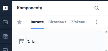
Component properties
Mask presentation (section Styling)
autoMask
Display of the mask in the date field (default value "true").
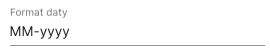
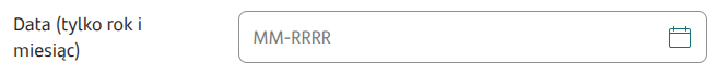
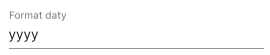
Date format (section Basic properties)
dateFormat
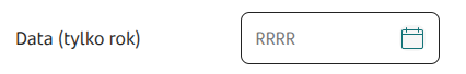
Date format. Default set to dd-MM-yyyy. Values you can use to build the date format:
yy - last two digits of the year
yyyy - year
MMMM - full month name
MMM - three-letter abbreviated month name (Jan, Feb, Mar etc.)
MM - two-digit month number (months 1 to 9 are prefixed with zero)
M - month number
d - day of the month number
dd - two-digit day of the month number (days 1 to 9 are prefixed with zero)
EEEE - full weekday name
EEE or EE - abbreviated weekday name (Mon, Tue etc.)
separators e.g. space, dot, hyphen etc.
The default date format for the component follows the locale settings.
Note! changing the date format affects how it is displayed in Default value (defaultValue). Any change of the format requires correcting the default date.
Date range (section Data quality)
dateRange
Narrowing the range of selectable dates. Available options:
ALL (all dates)
PAST (past dates including today)
PAST_WITHOUT_TODAY (past dates excluding today)
FUTURE (future dates including today)
FUTURE_WITHOUT_TODAY (future dates excluding today)
Field description (section Data quality)
description
Text displayed as a field description below it, by default this is empty. Availability of the functionality depends on the license and may not be available in all deployments.
Date change message (section Other)
dateRangeValidationText
Text shown after changing the date when an invalid value was entered. The default value is "The date has been changed."
Date set to today (section Other)
defaultValueOnToday
Display of the system date as the default value in the field (default value "false").
Dropdown for selecting month/year (section Other)
useDropDownSelector
Enabled dropdown for selecting month/year (default value "false").
With time (section Other)
withTime
Set to "true" means that time in the format: 00:00 will appear after the date
Unavailable dates
disabledDates
List of days (as timestamps) separated by commas whose selection should be blocked.
More information about component properties: Common component properties
External data source
We can feed the control using a script; for this we can use an external data source. The external data source can be configured in the Interactions section, and the parameters we can set are:
service - the service that will provide data to display the control
input parameters - list of service parameters that we can feed with variables or values from the form
output parameters - list of service output parameters that we can map to component attributes, the list of available attributes is:
value - initial value of the control represented by a timestamp. Example: 1739577600000
disabledDates - list of days that the user will not be able to select. The value is a list of timestamps separated by commas. Example: 1739145600000,1739577600000
dateRange - range of selectable dates. The range is recorded as two timestamps separated by a comma. Example: 1738800000000,1740009600000
disabledInputTyping - will it be possible to type the date? Possible values: true, false.
Example component settings
Set Date format (dateFormat) determines what the date component will look like on the form, for example:


Demo form: demoDatePicker
Additional component properties
Year presentation in calendar header (section Other)
showYearInHeadline
The calendar displays the year next to the month (default value "true").
Selection only from the calendar (section Other)
disabledInputTyping
Set to "true" means that date selection will only be possible from the popup. It will not be possible to type the date manually into the field. Desktop channel only.
Placeholder (section Data quality)
placeholderText
Text displayed as Placeholder the field placeholder, by default this is empty.
Start view (section Other)
startViewMode
Choice of the "screen" that will appear first after clicking the calendar. Possible values DEFAULT - behavior as before, MULTI_YEAR - display the year selection screen first.
Date format for unfocused field (section Basic properties)
unfocusedFormat
Custom date format for a field that does not have focus.
Allowed formats are the same as in the field with Date format. If the field is empty, then Date format for unfocused field is the same as in the field with Date format. If the field is filled with a format other than Date format, then this value will be visible after leaving the field, and Date format after clicking the field.
Last updated
Was this helpful?