
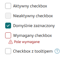
Checkbox

Component properties
Eximee Designer property
Attribute name in Source
Description
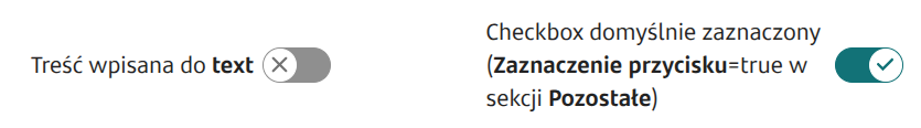
Feeding the checkbox text with different contents
Component state information
Key
Description
Available events
Name
Description
Available actions
Name
Description

Last updated
Was this helpful?