Feature availability depends on the license and may not be available in all deployments.
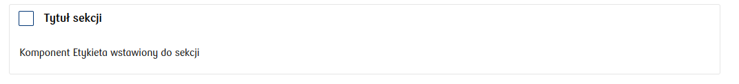
This component, like Section, allows grouping other components while simultaneously displaying a checkbox in the header.
Component properties
Eximee Designer property
Attribute name in Source
Description
Value of the selected button (section Basic properties)
valueYes
The value the checkbox takes when checked - by default, if no other value is set, the value "true" is returned.
Value of the unselected button (section Basic properties)
valueNo
The value the checkbox takes when unchecked - by default, if no other value is set, the value "false" is returned.
Section title (section Basic properties)
title
Content that is displayed next to the checkbox. You can use wikimarkup here and refer to variables ${variable}.
Dynamic section titles (section Other)
sectionDynamicTitles
Allows providing dynamic content for the section checkbox that depends on conditions. The first title in order whose condition is met will be displayed. If none of the conditions are met, the title specified in the property is displayed Section title.
Button checked (section Other)
checked
A value that determines whether the checkbox is checked by default.