Availability of functionality depends on the license and may not be available in all deployments.
A component that allows presenting components on a layer.
Component properties
Eximee Designer property
Attribute name in the Source
Description
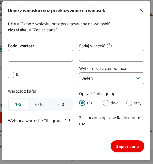
Title
(section Basic properties)
title
Popup title. It is possible to resolve variables in the title, e.g. ${sessionVariableName} or ${GesTextField1}.
Text displayed on the button that saves and closes the window
(section Basic properties)
closeLabel
Text displayed on the button used to save data in the popup and close the window at the same time. It is possible to use variables in the button content. If the field is not filled in, the button will have the default value "Save".
Text displayed on the button that cancels and closes the window
(section Basic properties)
cancelButtonLabel
Text displayed on the button used to close the popup without saving its data. The visibility of this button is determined by the property showCancelButton. If a new label is not defined, the button will have the content "Cancel".
Condition for disabling the button that closes the popup
(section Basic properties)
disableCloseButtonCondition
Disabling the buttons that close the popup ("x" in the title bar and the "close" type button).
Condition for disabling closing the popup by clicking on the backdrop
(section Basic properties)
disableBackdropClickCondition
Disabling closing the given popup by clicking on the backdrop.
Show cancel button
(section Basic properties)
showCancelButton
A flag that determines whether to display the "Cancel" button allowing closing the popup without saving changes made in it. Default value 'false'.
Save button active despite validation errors
(section Basic properties)
saveButtonAlwaysActive
A flag that determines whether the button that saves data in the popup should always be active (value 'true') or only when there are no validation errors in the popup (value 'false'). Default value 'false'.