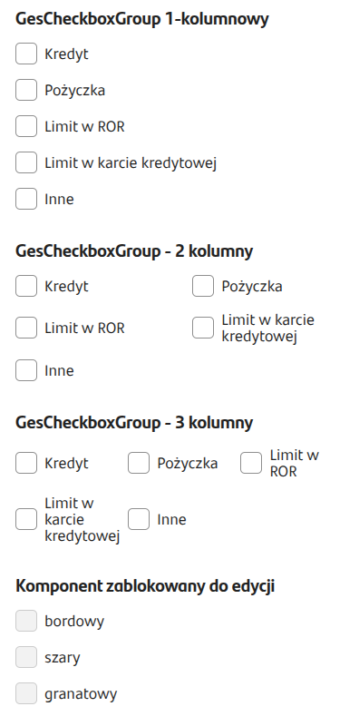
Figure 1. Example appearance of the component on the application
Populating from a dictionary
The component can receive data from a dictionary. Just attach a previously created dictionary in the field External data source.
Checkbox group - script as a data source
In CheckboxGroup components in EXTERNAL DATA SOURCE (External Data Source) you can attach scripts that, apart from the Id, return different values depending on the options selected in the input. This allows defining the content of the Checkboxes displayed in the group according to our needs and input-driven dependencies dynamically.
We can define the display of a Checkbox with an icon, description, additional description, a link that launches a popup, popup title, popup content, the number of occurring Checkboxes, and their selection.
An example implementation of a feeding script that returns defined field descriptions and icons depending on selected input options:
Figure 2. Example of mapping outputs in a component fed by a script.