
Label - Text
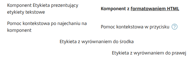
Component presenting text labels.
Component properties
Content (section Basic properties)
text
Label text to display during the application presentation. It is possible to refer to variables e.g. ${sessionVariable1} or ${GesTextField1} and use JavaScript insertions.
Display as paragraph
(section Basic properties)
displayAsParagraph
The checkbox controls the target HTML tag in which the text will be displayed:
checkbox checked - the control will be displayed in the
checkbox unchecked - the control will be displayed in the
Attention! If the control has the property labelRef set then the checkbox value is ignored and the tag
Field associated with the label (section Interactions)
labelRef
Using the property Field associated with the label we can link the component to a text label. Filling in the property (by selecting the identifier of the component linked to the label) allows the screen reader to skip reading this label. Additionally, in the Angular channel it provides support for setting focus on the associated field when clicking the label.
if the label applies to a single component → select that component from the list (e.g. for GesTextField5 the label is GesText7 — in the properties GesText7 select in labelRef component GesTextField5),
if the label applies to multiple components → choose the first or the most important component for the group of components (example: postal code consists of two TextFields, choose one of them)
Identifier of the component associated with the label (in the DOM using the for attribute). Components that can be associated:
GesCaptcha,
GesCombobox,
GesDatePicker,
GesDateRangePicker,
GesPlusMinus,
GesSingleSlider,
GesStepSlider,
GesTextArea,
GesTextField,
GesRadioGroup,
GesCheckboxGroup
If a component is not on the list it means that the property cannot be set for it Field associated with the label.
More information about the component's properties: Common component properties
Demo form: demoTextComponents and demoText
Last updated
Was this helpful?