Custom component - CustomComponent

The custom component (CustomComponent) allows creating your own application components using the JavaScript.

A CustomComponent consists of eight elements:

  • JavaScript script,

  • component CSS styles,

  • component HTML template,

  • mappings of component input parameters,

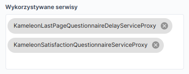
  • list of used services,

  • list of actions available for this component,

  • translations of texts for the component,

  • preview.

Creating a component

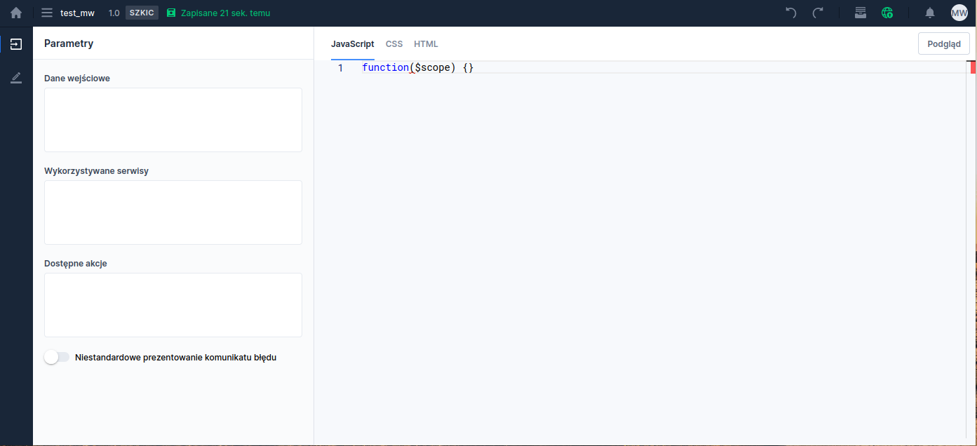
A new component is created the same way as other components. After navigating to the Library module and selecting the Custom components tab, click the Add custom component button and in the opened window set the name and location of the artifact being created (More information about the editor itself: Custom Components Editor)

Illustration 1. Edit view of a newly created component

JavaScript script

Each CustomComponent consists of one main function that is passed the Scope of the component:

Using the scope, the creator can, among other things, retrieve component data, input data, and react to certain lifecycle events of the component. The user can implement three system methods of the component:

  • afterViewInit - executed when the component is added to the application's DOM structure,

  • onModelChange - executed when the component's model (e.g., value) or input values change,

  • onDestroy - executed when the component is removed from the application's DOM structure.

Additionally, the component scope provides several useful elements:

  • fields:

    • domId - the component's ID in the application's DOM structure

    • componentId - the component's ID

    • componentMid - the component's MID

    • visible - variable controlling the component's visibility

    • translations - map of translations defined during component creation

    • componentId - map of component input parameters

    • componentData - map of the component's internal data (allows preserving the component state)

    • componentInput - map of the component's input data (keys are defined in the Inputs section, separated by commas)

  • methods:

    • getValue() - retrieves the current value of the component

    • setValue(value) - sets the current value of the component

    • querySelector(query) - returns the DOM element of the component that matches the selector.

    • putData(key, value) - sets a specified value (value) under the key (key) in the component's data map - client-side only (browser)

    • saveData(key, value) - sets a specified value (value) under the key (key) in the component's data map - also on the server side

    • getData(key) - retrieves the value stored under the key (key) in the component's data map

    • translate(key) - returns a translation from the translations map

    • clean() - cleans the scope object when it is no longer used by the CustomComponent

    • callServiceProxy(serviceName, params) - allows calling ServiceProxy and ScriptService synchronously

    • callServiceProxyAsync(serviceName, params) - allows calling ServiceProxy and ScriptService asynchronously

    • initTooltip(id, element, data) - allows initializing a tooltip with a given identifier (value required, must satisfy all HTML ID attribute constraints) on the provided element

    • showTooltip(id) - shows the tooltip with the given id

    • hideTooltip(id) - hides the tooltip with the given id

    • destroyTooltip(id) - destroys the tooltip with the given id

    • destroyAllTooltips() - destroys all tooltips of the component

    • goForward() - navigates to the next (allowed) page or submits the application (if the user is on the last page of the application)

    • goBackward() - navigates to the previous (allowed) page

    • setInactiveForward() - sets the navigate-next-page button to disabled (Availability depends on license and may not be available in all deployments.)

    • setActiveForward() - sets the navigate-next-page button to active (Availability depends on license and may not be available in all deployments.)

    • triggerCustomEvent(eventName) - allows triggering a CustomEvent previously defined for the component

    • sendCurrentValueEvent() - sends an event containing the current value of the CustomComponent along with its id

    • isPageValid() - returns information whether there are validation errors on the page

Component interfaces

Example of a component function

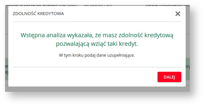
In the example above, a component is defined that displays a popup on the application with information about a positive credit decision:

Illustration 2. Popup designed using CustomComponent
In line 6 a system function is defined afterViewInit initializing the buttons X and NEXT, and also controlling the window visibility. In line 2 a function executed when one of the two buttons is clicked is defined.

DOM structure of the popup:

In the component template definition you can refer to defined translations using the convention _{TRANSLATION_KEY} - example in line 5.

Calling scripts or ServiceProxy

From within a CustomComponent you can call ServiceProxy and ScriptService using the methods callServiceProxy and callServiceProxyAsync. Both methods return an Observable with a response in the following format:

To obtain the response you should call the .subscribe() method known from RxJS. As with RxJS it is also advisable to call unsubscribe() at the appropriate time on the returned object. For example, unsubscribe can be called in the onDestroy

method.

Illustration 3. When using ServiceProxy or ScriptService it should be added to the list of used services on the CustomComponent:

Section "Used services"

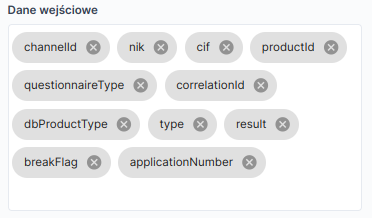
In the Component input fields Input data

Illustration 4. are defined by the ids of the component input fields. Ids should not contain spaces.

Section "Input data" INPUT PARAMETERS:

Illustration 5. Defined input fields can be fed by other application components in the same way as complex components (ComplexComponent) - by mapping appropriate data in the

Translations

Example of the "Input parameters" section for a CustomComponent added to the application Dedicated internationalized texts are defined in theComponent translations Translations.

section, which is displayed after selecting the button in the left panel Illustration 6a.

Section "Component translations"

In this view a key and the default value of the text used on the CustomComponent are defined. Text translations for required languages are defined in the standard way on the application where the component is attached.

  1. Example of adding a translation key: Add translation After clicking the button at the bottom of the panel

    you should add the translation key and the default value: Illustration 6b.
  2. Adding a new key and translation

    The added translation key can be used in the DOM structure of the CustomComponent: Illustration 6c.

  3. The "DOM" section with the example key "kg-final-survey-popup-title" entered Translations After adding the CustomComponent to the application or to a complex component in the

    tab, the keys from the CustomComponent will appear. They can also be added manually. Illustration 6d.

The "Translations" tab with CustomComponent keys

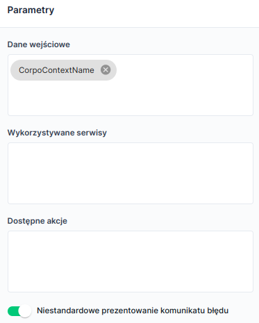
Message handling For the CustomComponent to handle validation messages itself, check the option in the parameters sectionCustom error message presentation . This option allows handling messages through the.

Illustration 7. onMessagesUpdate

method

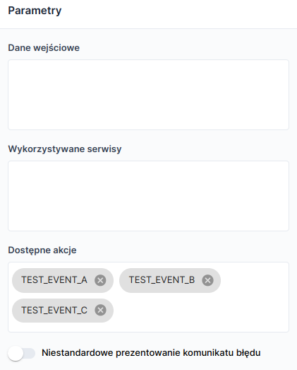
Definition of custom events for the componentFor each CustomComponent you can define individual actions (CustomEvents

Illustration 8. ). They are attached and handled in the same way as standard events defined in the platform. The action definition looks like this:

Actions added for the component

Illustration 9. Such defined actions can be bound to an action on the application. For example, the TEST_EVENT_A action is used to open a popup:

Application properties view - "Actions" section with an action defined from the CustomComponent The event itself can be triggered inside the customComponent JS script using the methodtriggerCustomEvent

$scope.triggerCustomEvent('TEST_EVENT_A');

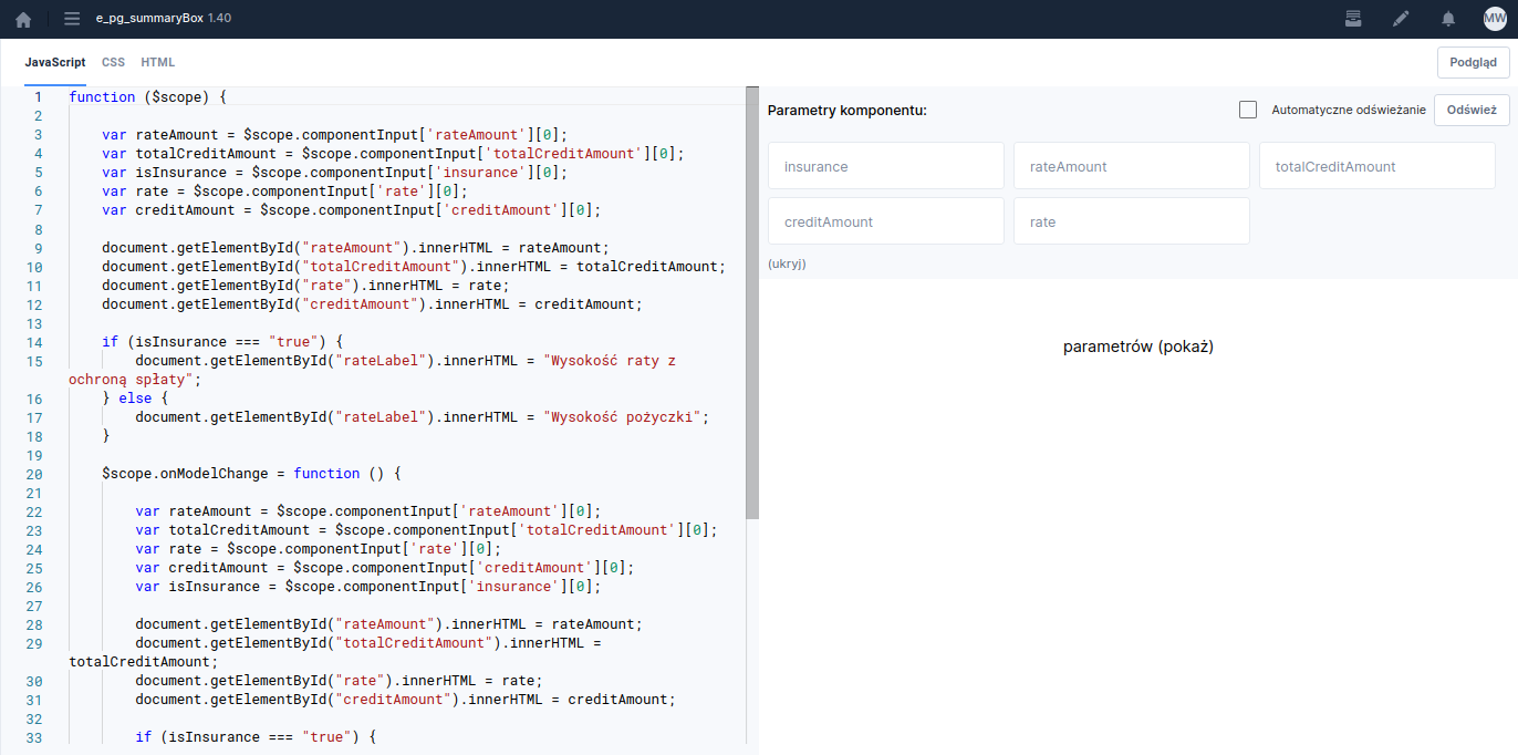
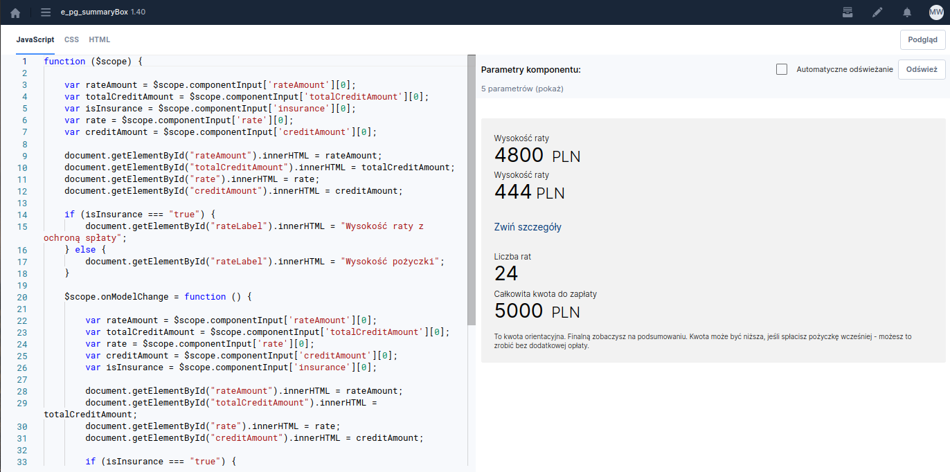
Component simulation PreviewTo check the behavior of the created CustomComponent you can use the simulation function. To do this click the button located on the right side of the screen JavaScript, . Clicking it changes the screen appearance to simulation mode. On the left side you will see panes and CSSHTML

Illustration 10. , and on the right the component parameters (provided input parameters have been defined). After starting the preview you can feed the component with variables retrieved in the component and observe its behavior without embedding it in the application and running it in a development environment.

Component view with preview enabled, without filling input parameters If you want changes in the preview to appear in real time, before filling in the component input parameter fields it is worth checking the optionAutomatic refresh . After filling all fields click theRefresh button. Then the fields with entered values are hidden and the component appearance is shown. You can always display the filled parameters again by clicking the option with the number of parameters and the label.

Illustration 11. (show)

Component view with simulation Preview Clicking the button again

will return us to the standard component view with the list of parameters on the left side.

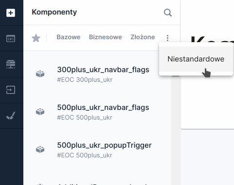
Embedding on the application The created CustomComponent is embedded in the application / in a complex component by adding it from the components palette. To do this, click the Add component button in the left side panel and in the slid-out components panel select theCustom tab, which is available after clicking the

Illustration 12. symbol. A list of available CustomComponents in the repository will be displayed. At the top of the panel there is a search field to quickly find the artifact to embed. Adding a component involves dragging it from the palette and dropping it in the appropriate place on the application.

List of components after clicking the Custom tab After embedding the component in the application you need to populate the component's input fields (defined according to the the component) Input fields section) by clicking in the Basic window the INPUT PARAMETERS:

Illustration 13. properties

Window for defining CustomComponent input parameters

Controlling the activity of the navigate-next button

  • In the JavaScript tab of the edited CustomComponent you can use the methods: setInactiveForward()

  • - sets the navigate-next-page button to disabledsetActiveForward

() - sets the navigate-next-page button to active Keep in mind that calling the setInactiveForward afterViewInit method inside

will cause the button to be disabled on every change of the component's visibility - so this should be taken into account in the implementation. You can condition the button's activity on the channel in which the application is displayed using the conditional statement if channel and , taking into account the session variables channelDescritpion

(remember to map them to the component beforehand).

Calling native API The $scope object provides the functioncallNative

The availability of functionality depends on the license and may not be available in all deployments.

$scope.callNative(nativeApi => nativeApi.setTitle('title'));

Controlling the platform loader

  • On the window object there are methods available to control the platform loader:

  • startSpinner() - turns the loader on

Last updated

Was this helpful?