
Adding and parameterizing components
Adding a new component
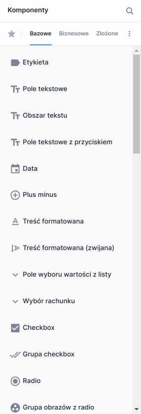
A new component can be added in edit mode using the component palette located on the left. To do this, drag the selected component from the palette and drop it in the appropriate place on the form.
Edit mode and moving a component
To comfortably move components around the form area, it's worth enabling the layout grid mode using the button Layout grid  located in the lower left corner of the form. After clicking it, a grid will appear on the form to help position and resize components (Layout grid / theme).
To move a component, hold the mouse button over it and drop it in the desired location. Fields in two colors will light up above the picked-up component:
green: indicates a valid place for the component being inserted,
red: invalid place (for example, trying to place one component on top of another or place a component inside an embedded composite component or a radio group).
If you want to drop a component on a new line, hover over the space between components. That space will expand, making it easier to drop the component.
After moving the last component from a given row, that row will be automatically removed.
Possible operations for moving components
page
page
all

page
section
all
section
page
all
section
section
all
composite component
anywhere
all
anywhere
composite component
all

checkbox group
anywhere
checkbox
radio group
anywhere
radio
tile group
anywhere
tile
Changing component width
Changing component widths (layout)
Go to the content editor placed on the form/in the component
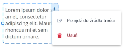
In the context menu of a formatted content component there is an option to open the associated artifact in the content editor.
Selecting Go to content source takes the user to the content editor in the library.
The option Go to content source is available only when an artifact in the name-version format is attached to the component.
Go to the source editor of a composite/business component
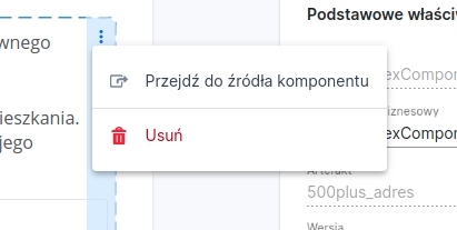
In the context menu of an embedded composite/business component there is an option to open the attached artifact in the component editor.
Selecting Go to component source will take the user to the composite/business component editor in the library.
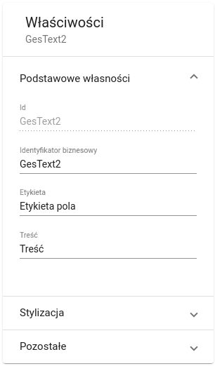
Component properties panel
Clicking on a component placed in the workspace opens the attribute editing panel for that component (the selected component is marked with a dashed frame).
To view parameters for a composite or business component, select it by clicking the handle that appears above the component on the left.

Properties are grouped into sections. Clicking in a place not occupied by any component or outside the page area allows previewing the properties of the entire page.
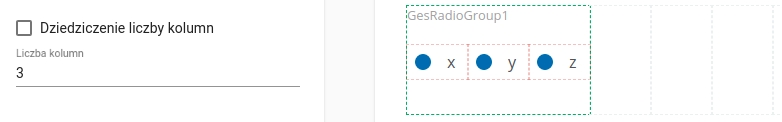
Inherit number of columns
Composite components (e.g., tile group, radio group) have the option to enable the Inherit number of columnsproperty. It causes the column widths in the component to be the same as in its parent. This is achieved by ensuring that the component's width always corresponds to its number of columns. When changing the width of such a component, columns will be added or removed accordingly. Because of this, you can reduce the component's width only if it contains empty columns.
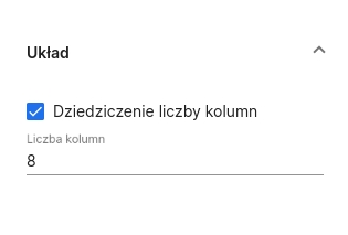
The option to enable inheriting the number of columns is active only when the component's width is the same as the number of columns. Changing the number of columns from the attribute editor will disable this property.

Example usage:
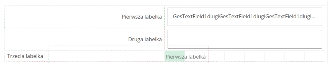
Consider the case of expanding a composite component by 3 cells, where its width and number of columns are both equal to 3.
Component with the "Inherit number of columns" property
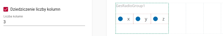
After expansion the number of columns is still equal to the width. Three additional empty columns were created.
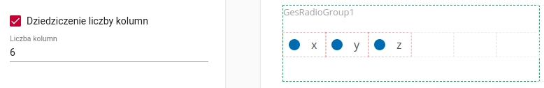
Component without the "Inherit number of columns" property
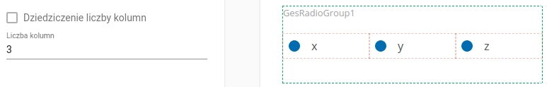
The expansion did not change the number of columns in the component—they remain 3. The component's width was increased to 6. Each component column is now stretched across two page cells.
Mapping the value to a field of an external data model
The external data model field to which the component's value will be mapped can be chosen in two ways:
from a selection field,
from a tree.
Defined mappings are added at the end of the unconditional mapping group.

You can only edit field mappings that have no more than one mapping defined. Otherwise, the editor will show a button redirecting to the Data modeltab, which allows defining more complex mappings.

The mapping editor is visible only when the form has at least one external system process defined.
Removing components from the page
Components can be removed by clicking the menu button located in the upper right corner of the selected component, then choosing the Deleteoption. If removing the component is not possible, the delete icon does not appear.

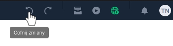
Undoing actions
The user can use the option to undo any change made while working with the working copy (from the moment it was created). To undo the effects of the last action performed, simply press the Undo changes button located in the upper right corner of the editor, or use the keyboard shortcut Ctrl + Z.
During undo operations all interactions with the editor are blocked. Changes can be undone any number of times (until the original state of the artifact is restored).
Note: operations are undone regardless of the currently open tab. For example, if the user makes a change in the Data modeltab, and then switches to the Stepstab, undoing changes will undo the change from the first tab.
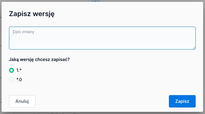
Saving versions
To save a new version of an artifact press the Save  icon located on the right part of the top bar. This will open a popup where you can fill in a description of the change and choose whether to save the artifact in the existing branch (MINOR) or create a new branch (MAJOR). When saving a new version of the form, it is automatically published.
Last updated
Was this helpful?