# Repeatable section - RepeatableSection

A set of fields that can be filled in repeatedly in the application by the user.

![](/files/8b860480d57efc3e177d0d3f46d30f0227144634)

## Component properties

<table><thead><tr><th>Eximee Designer property</th><th width="187.583251953125">Attribute name in the Source</th><th>Description</th></tr></thead><tbody><tr><td><strong>Minimum number of section occurrences</strong><br>(section <strong>Basic properties</strong>)</td><td>minCount</td><td>Minimum number of occurrences of the repeatable section (initial value 1). When the application is displayed, this is also the number of occurrences that are visible and available by default. When removing section items while filling out the application, you cannot go below this number.</td></tr><tr><td><strong>Maximum number of section occurrences</strong><br>(section <strong>Basic properties</strong>)</td><td>maxCount</td><td>Maximum number of occurrences of the repeatable section (initial value 1). When adding section items, you cannot exceed this number.</td></tr><tr><td><strong>Title</strong><br>(section <strong>Basic properties</strong>)</td><td>title</td><td><p>Title.</p><p>Availability of the functionality depends on the license and may not be available in all deployments.</p></td></tr><tr><td><strong>Title of the entire repeatable section</strong><br>(section <strong>Basic properties</strong>)</td><td>parentSectionTitle</td><td>Title for the entire repeatable section.</td></tr><tr><td><strong>Section collapse button label</strong><br>(section <strong>Other</strong>)</td><td></td><td><p>Section collapse button label.</p><p>Availability of the functionality depends on the license and may not be available in all deployments.</p></td></tr><tr><td><strong>Section expand button label</strong><br>(section <strong>Other</strong>)</td><td></td><td><p>Section expand button label.</p><p>Availability of the functionality depends on the license and may not be available in all deployments.</p></td></tr><tr><td><strong>Collapsible section</strong><br>(section <strong>Other</strong>)</td><td>foldable</td><td><p>Specifies whether the section should be collapsible (initially set to "false").</p><p>Availability of the functionality depends on the license and may not be available in all deployments.</p></td></tr><tr><td><strong>Section collapse condition</strong><br>(section <strong>Other</strong>)</td><td>foldedCondition</td><td><p>Section collapse condition.</p><p>Availability of the functionality depends on the license and may not be available in all deployments.</p></td></tr><tr><td><strong>Section expansion presentation mode</strong><br>(section <strong>Other</strong>)</td><td>presentation</td><td><p>Defines how section expansion is presented. Available collapse/expand presentation types: STANDARD and LABELS (more detailed description below).</p><p>Availability of the functionality depends on the license and may not be available in all deployments.</p></td></tr><tr><td><strong>Dynamic button labels</strong><br>(section <strong>Other</strong>)</td><td>plusMinusLabels</td><td>Conditions for the visibility of buttons for adding/removing repeatable section items.</td></tr><tr><td><strong>Section removal button label</strong><br>(section <strong>Other</strong>)</td><td>minusText</td><td>Label for the minus button (removing a repeatable section item).</td></tr><tr><td><strong>Section add button label</strong><br>(section <strong>Other</strong>)</td><td>plusText</td><td>Label for the plus button (adding a repeatable section item).</td></tr><tr><td><strong>Expanded section title</strong><br>(section <strong>Other</strong>)</td><td>rowTitleExpanded</td><td><p>Title displayed for the expanded section.</p><p>Availability of the functionality depends on the license and may not be available in all deployments.</p></td></tr><tr><td><strong>Collapsed section title</strong><br>(section <strong>Other</strong>)</td><td>rowTitleCollapsed</td><td><p>Title displayed for the collapsed section.</p><p>Availability of the functionality depends on the license and may not be available in all deployments.</p></td></tr><tr><td><strong>Component border</strong><br>(section <strong>Other</strong>)</td><td>parentSectionFrameVisible</td><td><p>Setting this flag displays a frame around all occurrences of the repeatable section (initially set to "false").</p><p>Availability of the functionality depends on the license and may not be available in all deployments.</p></td></tr><tr><td><strong>Add button offset value</strong><br>(section <strong>Other</strong>)</td><td>plusButtonOffset</td><td><p>Add button offset value (initially set to 0).</p><p>Availability of the functionality depends on the license and may not be available in all deployments.</p></td></tr><tr><td><strong>Delete button tooltip</strong><br>(section <strong>Other</strong>)</td><td>minusToolTipText</td><td>Tooltip for the row delete button</td></tr></tbody></table>

> More information about component properties: [Common component properties](/documentation/documentation-en/budowanie-aplikacji/interfejs-uzytkownika/formularze/praca-z-komponentami-bazowymi/wspolne-wlasciwosci-komponentow.md)

## Working with a repeatable section

Placing a repeatable section on the application template adds an area that can be worked with similarly to the entire application. This means that this area has its own page layout and can contain any number of base components. In the example in the figure, the repeatable section occurrence was configured as a composite consisting of a text field and list value selection fields with labels. The plus/minus sign in the bottom right corner is used to add more rows of the section.

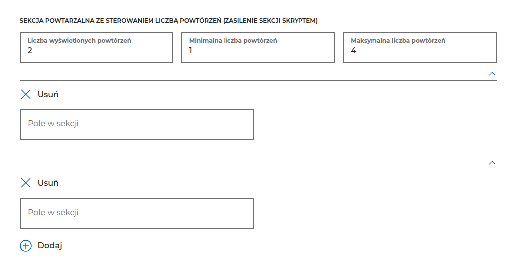
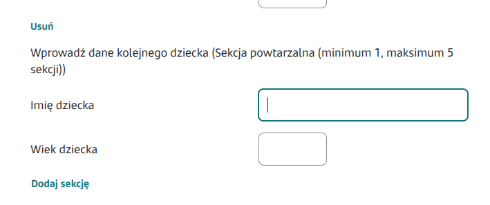
In the resulting application, repeatable section occurrences are displayed according to the configuration. The user can remove or add occurrences using the button respectively **minus** and **plus**.

<figure><img src="/files/145e4a05c514a730160bb75c05d582c03283c89e" alt=""><figcaption><p><em><strong>Figure 1.</strong> Example appearance of the component on the application.</em></p></figcaption></figure>

{% hint style="warning" %}
In Repeatable Section you cannot use [session variables](/documentation/documentation-en/budowanie-aplikacji/interfejs-uzytkownika/formularze/zmienne-sesyjne.md) — here we use technical fields (e.g. the Text Field component with the property selected [Technical field](/documentation/documentation-en/budowanie-aplikacji/interfejs-uzytkownika/formularze/praca-z-komponentami-bazowymi/wspolne-wlasciwosci-komponentow.md)). Also, feeding fields from a service in a repeatable section may cause unusual errors — e.g. incorrect display of components (but it does not have to). In such a situation, use a workaround in the form of a technical field.
{% endhint %}

## Feeding a repeatable section with a service

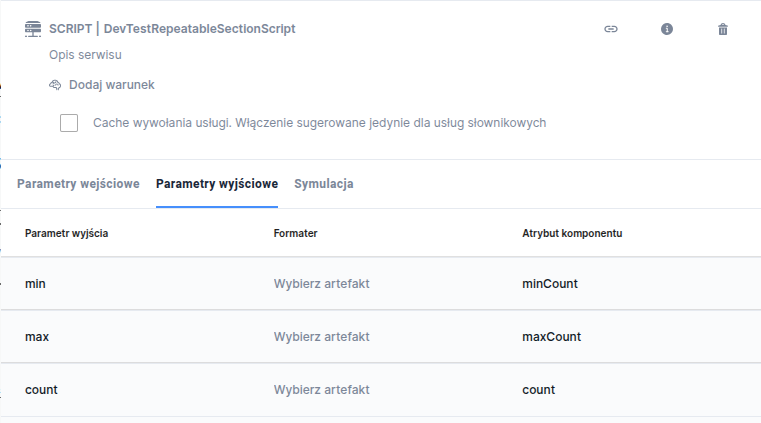
It is recommended that when creating a ServiceProxy, you inherit from the class **AbstractRepeatableServiceProxy**. This class automatically returns 3 values: minCount, maxCount and count. These values can be set or left untouched — they are optional.

Example ServiceProxy:

* It has 2 input fields added,
* It has 2 additional output fields added (**minCount**, **maxCount**, **count** added in the class above),
* To set the parameters, you only need to call the appropriate setters on the model **RepeatableSectionMetadata** ,
* After setting the above parameters, we set the values that we will later map to individual fields.

```java
@Component
@Service(AbstractServiceProxy.class)
public class RepeatableTestSp extends AbstractRepeatableServiceProxy {

    public RepeatableTestSp(String name, String description) {
        super("RepeatableTestSp", "Description...");
        this.inputFields.add(new ServiceProxyField("input1"));
        this.inputFields.add(new ServiceProxyField("input2"));
        this.outputFields.add(new ServiceProxyField("output1"));
        this.outputFields.add(new ServiceProxyField("output2"));
    }

    @Override
    protected RepeatableSectionMetadata callRepeatableSectionService(
            Map<String, List<String>> requestParams, String lang) throws ServiceProxyException {
        final RepeatableSectionMetadata repeatableSectionMetadata = new RepeatableSectionMetadata();
        repeatableSectionMetadata.setMinCount(1);
        repeatableSectionMetadata.setMaxCount(10);
        repeatableSectionMetadata.setCount(5);
        repeatableSectionMetadata.setRepeatableSectionRows(createRows());
        return repeatableSectionMetadata;
    }

    private List<Map<String, String>> createRows() {
        final List<Map<String, String>> rows = new ArrayList<>();
        rows.add(createRow());
        rows.add(createRow());
        return rows;
    }

    private Map<String, String> createRow() {
        final Map<String, String> map = new HashMap<>();
        map.put("output1", "1");
        map.put("output2", "abc");
        return map;
    }
}
```

To use the above ServiceProxy, in **externalDataSource** the type should be **REPEATABLE\_SCECTION\_SERVICE**.

In summary: the service added 2 rows, but it set the count value to 5. So 5 rows will be displayed, of which only 2 will be filled with the mapped value from the output1 endpoint.

{% hint style="info" %}
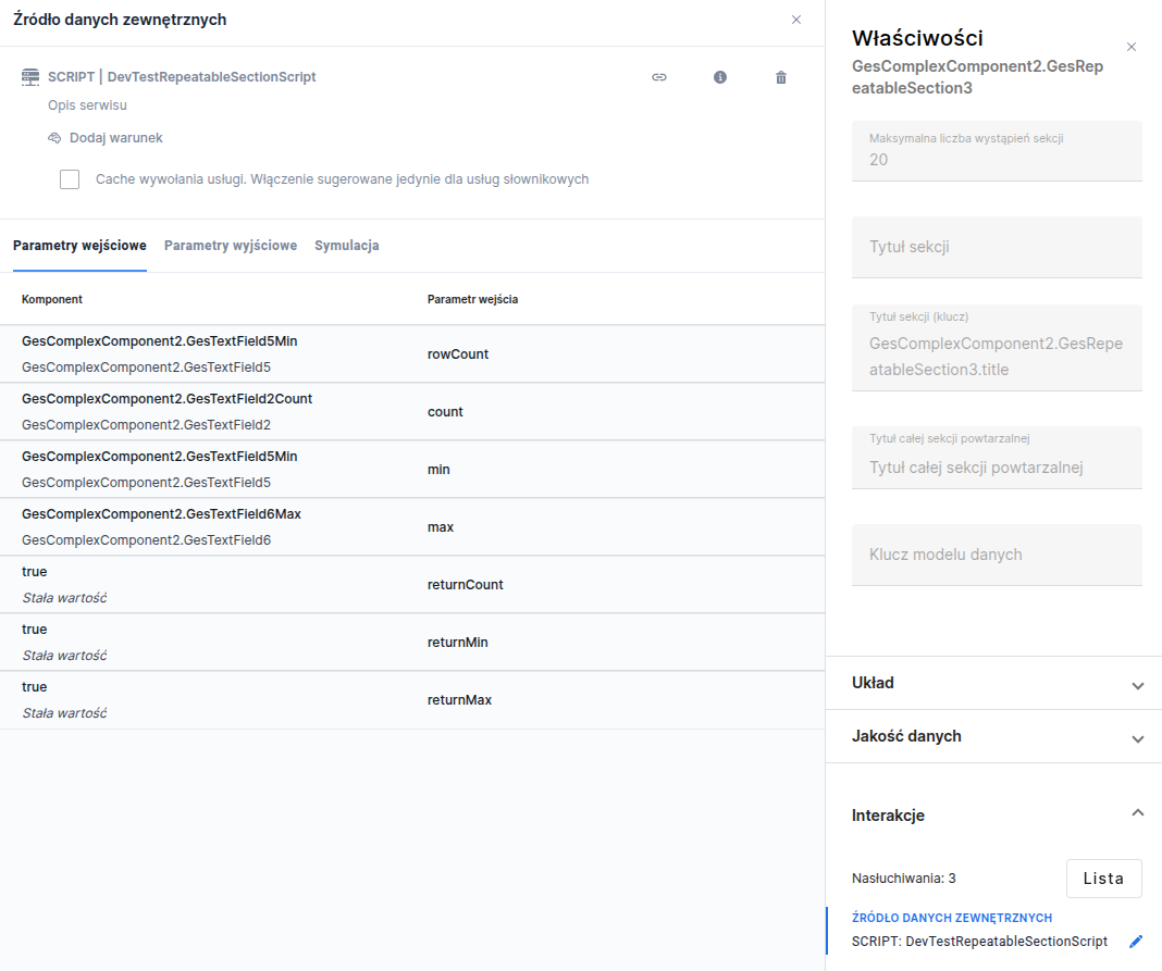
It is also possible to feed a repeatable section with a script.
{% endhint %}

## Example of a repeatable section with values to sum

When we want to sum values from the repeating GesTextField1 component in the repeatable section, we create a new GesTextField2 outside the section and attach in **External data source** the SumService script:

```javascript
function callService(context) {
    let parts = context.getParameters('parts');
    
    let result = BigDecimal.valueOf("0");
    
    if (!!parts) {
        for (let i = 0; i < parts.size(); i++) {
            let part = parts.get(i);

            if(!!part){
                let bigDecimalItem = BigDecimal.valueOf(part.replace(',','.'));
                result = result.add(bigDecimalItem);
            }
        }
    }
    
    return [{'output': result.setScale(2)}];
}
```

In the script input parameters, we attach the repeating component with values to sum, GesTextField1, and in the output parameters we choose output, i.e. the sum of values, as the text attribute.

<figure><img src="/files/dda6d69d8d525e82d4823ce332269ba1260596d8" alt=""><figcaption><p><em><strong>Figure 2.</strong> Attaching the output parameter in the SumService script</em></p></figcaption></figure>

{% hint style="info" %}
Demo applications:

* demoRepeatableSection
* repeatable\_section\_service (application showing feeding a section with a service or script)
* demoRepeatableSectionValidator (application with a validator for repeating values in the section)
  {% endhint %}

{% hint style="info" %}
♿WCAG: [WCAG best practices for low-code dev](/documentation/documentation-en/budowanie-aplikacji/proces-biznesowy/tworzenie-procesu-biznesowego-w-bpmn-2.0/dobre-praktyki.md)
{% endhint %}


---

# Agent Instructions: Querying This Documentation

If you need additional information that is not directly available in this page, you can query the documentation dynamically by asking a question.

Perform an HTTP GET request on the current page URL with the `ask` query parameter:

```
GET https://docs.eximee.com/documentation/documentation-en/budowanie-aplikacji/interfejs-uzytkownika/formularze/biblioteka-komponentow-bazowych/7-komponenty-specjalne/sekcja-powtarzalna-repeatablesection.md?ask=<question>
```

The question should be specific, self-contained, and written in natural language.
The response will contain a direct answer to the question and relevant excerpts and sources from the documentation.

Use this mechanism when the answer is not explicitly present in the current page, you need clarification or additional context, or you want to retrieve related documentation sections.