> For the complete documentation index, see [llms.txt](https://docs.eximee.com/llms.txt). Markdown versions of documentation pages are available by appending `.md` to page URLs; this page is available as [Markdown](https://docs.eximee.com/documentation/documentation-en/budowanie-aplikacji/interfejs-uzytkownika/formularze/biblioteka-komponentow-bazowych/1-wprowadzanie-danych-inputs/komponent-pin-pinfield.md).
# PIN component - PinField
{% hint style="info" %}
Availability of functionality depends on the license and may not be available in all deployments.
{% endhint %}
Component used for entering a PIN code. It currently supports 4- or 6-digit codes. The number of digits in the component depends on the implementation. The component's value is sent after the entire PIN has been entered; validation also occurs then.
✅ **When to use:**
* When data must be entered with a strictly specified number of characters (e.g. a 4-digit login PIN code or a 6-digit SMS authorization code).
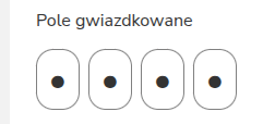
* When, for security reasons, you want to mask the entered characters (the component allows masking digits with dots).
:x: When not to use:
When the length of the entered string varies (e.g. a password for an account with a length of 8 to 20 characters). **Use**: [TextField](/documentation/documentation-en/budowanie-aplikacji/interfejs-uzytkownika/formularze/biblioteka-komponentow-bazowych/1-wprowadzanie-danych-inputs/pole-tekstowe-textfield.md).
## Component properties
| Property | Description |
| --------------------------------------------------------- | ------------------------------------------------------------------------------------------------------------------------------------------------------------------------------------------------------------------------------------------------------------------------------------------------------------- |
| **ARIA label** (section **WCAG**) | Property corresponding to comma-separated attributes `aria-label` of the individual inputs that make up the PIN component. By default, "1,2,3,4,5,6". To make a screen reader user aware that they are in a PIN control, it may be necessary to modify this value, e.g. to "pin control 1,pin control 2,...". |
| **Character masking in the field** (section **Security**) | Selecting the "Character masking in the field" option in the component properties (Security section) causes the entered characters to be replaced with dots in the field view. |
> More information about component properties: [Common component properties](/documentation/documentation-en/budowanie-aplikacji/interfejs-uzytkownika/formularze/praca-z-komponentami-bazowymi/wspolne-wlasciwosci-komponentow.md)
## Component appearance
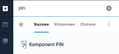
Figure 1. The component's appearance on the form.
Figure 2. Component appearance for a 4-digit code.
Figure 3. Component appearance with character masking.
{% hint style="info" %}
Demo application: demoPin
{% endhint %}
---
# Agent Instructions
This documentation is published with GitBook. GitBook is the documentation platform designed so that both humans and AI agents can read, navigate, and reason over technical content effectively. Learn more at gitbook.com.
## Querying This Documentation
If you need additional information that is not directly available in this page, you can query the documentation by asking a question.
Perform an HTTP GET request on the following URL with the `ask` and `goal` query parameters:
```
GET https://docs.eximee.com/documentation/documentation-en/budowanie-aplikacji/interfejs-uzytkownika/formularze/biblioteka-komponentow-bazowych/1-wprowadzanie-danych-inputs/komponent-pin-pinfield.md?ask=&goal=
```
`ask` is the immediate question: it should be specific, self-contained, and written in natural language.
`goal` is what the user is ultimately trying to achieve, the reason they need the answer. Sharing it helps GitBook give you a better, more relevant answer. A goal is most helpful when it describes the outcome the user wants rather than restating the question. For example, with `ask=how do I create an API token`, a goal like `automate deployments from our CI pipeline` lets GitBook tailor the answer to that use case.
The response will contain a direct answer to the question and relevant excerpts and sources from the documentation.
Use this mechanism when the answer is not explicitly present in the current page, you need clarification or additional context, or you want to retrieve related documentation sections.