For the complete documentation index, see llms.txt. This page is also available as Markdown.

Section - Section

A section component for grouping other components.

When to use:

  • You want to group other components into a logical block (e.g. personal data).

When not to use:

  • It is only a simple separator without grouping content. Use: HorizontalLine.

  • There should be an option to enter the same type of data multiple times (e.g. children’s data). Use: Repeatable section.

Component properties

Eximee Designer property
Attribute name in Source
Description

Title (section Basic properties)

title

Section title. It is possible to reference variables or fields in the section title, e.g. ${sessionVariableName} or ${GesTextField1}.

Collapsible section (section Other)

foldable

Specifies whether the section should be collapsible. Default is "false" - not collapsible.

Availability of the functionality depends on the license and may not be available in all deployments.

Section collapse condition (section Other)

foldedCondition

Section collapse condition - if it is met, the section is collapsed. For presentation=STANDARD the condition is evaluated at the very beginning and is used only for the first display of the section. For presentation=LABELS changing the condition value causes the section to be modified (collapsed and expanded) while the application is displayed.

Availability of the functionality depends on the license and may not be available in all deployments.

Graphical representation of the field (section Other)

presentation

Defines the way section expansion/collapse is presented. Available collapse/expand presentation types: STANDARD and LABELS (more details below). Availability of the functionality depends on the license and may not be available in all deployments.

Availability of the functionality depends on the license and may not be available in all deployments.

Dynamic section title (section Other)

sectionDynamicTitles

Allows you to define section titles that depend on conditions. The first title in order whose condition is met will be displayed. If none of the conditions is met, the title provided in the property is displayed title. It is possible to reference variables or fields, e.g. ${sessionVariableName} or ${GesTextField1}.

Technical section (section Other)

technicalSection

Disables grouping of fields in the section (does not add elements fieldset and legend). This avoids excessive grouping in the HTML structure, which makes it easier to adapt the form to WCAG requirements.

> More information about component properties: [Common component properties](../../../praca-z-komponentami-bazowymi/wspolne-wlasciwosci-komponentow.md)

Component dependencies in the section

When the value of the component on which the section depends changes, the state of the section and all components inside it is recalculated.

When any component in the section changes, the values of all components that depend on it are recalculated.

Component layout (layout)

A layout can be defined on the section analogously to the layout for the application page (more in: Changing component widths (layout)).

Dynamic section title data

The section title can be dynamically populated, for example using session variables. If in the property title we enter a session variable in the form ${sessionVariableName} then the section title will take the value of the session variable and every time the value of that variable changes, the section title will also change.

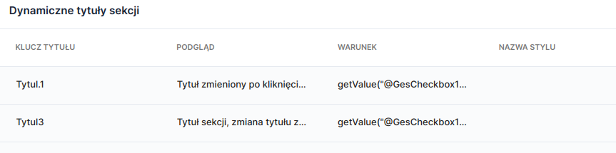
Another way to dynamically populate the section title is to use the property Dynamic section title (Section - dynamic section titles). In the displayed window, each subsequent title is added by clicking the button Add dynamic section title. In the column TITLE KEY you should enter the key previously defined in the Translations tab. The key value will be displayed automatically in the column PREVIEW. The condition is defined according to the description in Advanced condition editor.

Figure 1. Window for defining conditional section titles.

In the property Dynamic section title conditions are defined for when the section title should change. If the condition getValue("@GesCheckbox1")=="Y" is met (i.e. Checkbox1 takes the value Y - is selected), then the section title will take the value (PREVIEW) specified for the defined key TITLE KEY (i.e. in this situation, meeting the condition sets the section title to "Title changed after clicking ..."). If the condition is not met, the title specified in the property will be displayed Title.

Figures 2 and 3. Dynamic section title data - preview on the application.

Section with collapsible/expandable option

Availability of the functionality depends on the license and may not be available in all deployments.

Two types of collapse/expand presentation are available for the section (property Graphical representation of the field):

  • STANDARD - section collapsed/expanded using a button located at the end of the section

  • LABELS - section (without a title!) collapsed/expanded using the text set in Section collapse/expand button label.

If a validation error occurs on components inside a collapsed section, the user will not be notified in any way and will also not be able to move to the next page. It is the application designer’s responsibility to provide an appropriate validator on the page.

Demo application: demoSection

Last updated

Was this helpful?
